
Often when I first open a raw photo I know that I’ll want to edit one part of it differently than another. Photo RAW’s non-destructive, masked workflow makes this easier than ever. A trick I often employ is starting by creating a mask before I do even the most basic of raw processing. By initially adjusting Develop’s basic tone sliders to unusual extremes, I can simplify creating a very useful mask to use later in the editing process. In this video, I’ll walk you through my process.
First, we’ll jump into Develop. You’ll see there’s so much shadow detail even in what looks black on the back LCD of your camera:
The point is to not blow the highlights. If I pull this exposure slider in our tone and color settings in Develop, you’ll see that there’s a lot of shadow detail there:
Typically what I would do is I would go in, look at the clipping mask, set the white point and the black point- don’t worry, we’re going to do that in a minute, if that’s not familiar, I’ll show you what I’m talking about- and really get my tones and colors just dialed. But in this particular case I know I want to edit the sky differentially than the rock in the foreground. I know I’m going to want to edit those two things separately for tone and color and finish editing even. And so if I can build a mask right now and have it in my back pocket for when I’m doing that finished editing, it’s going to make the whole process that much easier. And there’s a bunch of ways to do this- you could use luminosity masks, but I have a quick down and dirty way to do that with a high contrast scene like this- and I’m going to show you what I’m talking about.
Opposite of what I might normally do at this stage with an image with getting the blacks so that I’m not quite going to pure black instead I’m just going to turn these blacks way down to where- all the way down, even- to where I’m making those rocks basically almost a pure silhouette:
I’m going to turn the whites up just a little bit to make the sky stand out even more:
I’m going to go ahead and turn the contrast up a little bit:
That right there is going to make this mask so much easier to build because we’ve got basically pure black and a really high contrast edge where I really want to build a mask that keeps the rocks separate from the sky.
I’m going to jump in here into local adjustments, I’m still in Develop, I’m just in local adjustments, that gives me the ability to build a mask.
I’m using my local adjustments masking brush. I’m going to set the feather to zero- I want a nice hard edge on my mask. I don’t want to be kind of blurring any lines. I want the opacity set to 100 percent, I’m building a hard, pure mask, and I’m going to go ahead and set the perfect brush setting, and because I’m using a Wacom tablet, I want to make sure that I have “Pressure Adjusts Size” set:
One thing that’s kind of cool on the Wacom tablet is you’ve got this little touch wheel, it’s like an old iPod click-wheel, and I’ve got it set right now that it changes the brush size, it’s the same as pressing the bracket keys on the keyboard to make my brush bigger or smaller. And because I have pressure adjusts size, just touching lightly will use a smaller portion of that setting, I’m kind of setting the maximum right here.
What I’m going to go ahead and do, I want to turn on one more thing, I want to turn on the Mask View:
Right now that mask view is set to Grayscale, but I want to use the Red Overlay, so here in the Mask menu < View Mode < Red Overlay- that’s going to let me work with the underlying image while I see what I’m doing on the mask.
I’m going to see some of those tones coming through the masked and unmasked portions, but it still lets me get a good idea of what I’m working on. So, I want to come here right on the edge:
Because I’m using the perfect brush, I’m going to not quite cross that plus sign that’s over that contrast edge, and it’s just going to go ahead and it knows that I want one side masked and one side not. The perfect brush is kind of an amazing tool. I often use short brush strokes, I’m not going to just keep this held down.
Whether I’m using a mouse and clicking or whether I’m using a Wacom pen like this because if I mess up and go into the sky, I want to just be able to hit ⌘ + Z or Control + Z on the PC and really quickly just erase that mistake. I don’t want to have to spend a lot of time redoing a whole section of the image that I just painted in one-click. Short brush strokes definitely are a godsend when you make a mistake, because then you realize, oh man, I just didn’t waste a minute painting the longest brush line in the world.
So, you can see that setting those tones is what’s making this such a piece of cake and so accurate. Now granted, if I was doing this for a finished edit, if I were going to make a print, if I’m working for a client, I’m probably going to zoom in to 50 percent or 100 percent, really be ultra careful and make sure that every little bit of the edge is perfect. I can make the brush smaller and get in there and just make sure that it’s all working absolutely perfectly. And you’ll notice because I have that red overlay, you’re still going to see some of that underlying brightly lit tone coming through my mask portion here.
Now, if I didn’t have this set to pretty much just be a silhouette, I would probably turn off the perfect brush setting now, because if you have a bunch of different tones that you’re working with, it can be tricky using the perfect brush, you can leave little bits behind, I’m actually going to leave a little bit behind here, accidentally, so it’s sort of accidentally on purpose to show you a trick with using the different mask views when I’m done with this. But because I have it set to nearly pure black silhouette, there’s no reason not to go ahead and use the perfect brush setting and paint everything I want out, out. It makes it easier if I accidentally cross over a line, it’s just going to be good to go.
So, pretty much got my mask built there, I want to just check that I didn’t miss any places, accidentally, so I’m going to go over to View Mode < Grayscale, and now, everything that I missed really stands out.
And now, I will go ahead and turn off that perfect brush setting because part of the problem is there are some tones in here, sometimes I kind of have to jog this (paint out/paint in), just a little switch, sometimes there’s a little weirdness here and there with the Wacom tablet.
So, there we go, painted those right back out:
And if I turn off this view (mask view), we’re back to our image.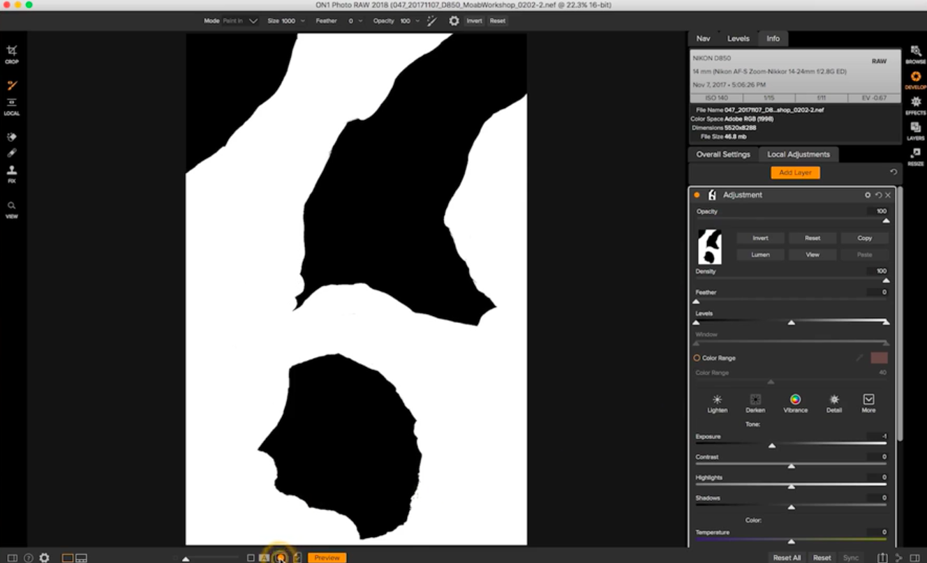
Now, remember, I’m in local adjustments in Develop, and if I take a look at the last local adjustment I made, it was just a little burning, I just have exposure turned down. I want to keep this mask, I don’t want to do anything with it, I’m going to copy it just to be extra careful:
I’m going to go ahead and hit this little Revert button here, and that’s going to reset every setting on this local adjustment. So that local adjustment is now doing absolutely nothing to my image, I just have a mask built from it.
I’m going to jump back into Develop’s overall settings, and I’m going to do the same thing with it, I’m just going to hit the little reset button so that absolutely nothing is happening with the image.
It’s just like when you first looked at it when it was straight out of the camera raw. And now I’m going to go ahead and treat it like any other raw image, I’m going to hold down my J key, and I’m going to go ahead and set the blacks so that I’m just starting to clip a little bit, you can see those blue areas showing up on the image, that’s pure black on my image:
I’m going to do the same thing with whites, I’m going to pull the white slider up until I start seeing pure white blooming in that lower cloud section, I want to turn it back to where I’m not quite clipping any white in case I want to print this, I don’t want any of the paper to not show white.
That’s my white and black point, now I’m going to go ahead and boost the shadows, and I’m really not going to worry too much about what it’s doing to the sky, because I know I can go in and edit the sky separately. I’m going to use this RAW processing to make sure that the shadows look exactly like I want. So I’m really going to boost those shadows up. I’m going to see if highlights do much to that brightly lit section of the rock, and they really aren’t, it’s more about that cloud. I’m going to look at contrast, I probably want to back contrast off a little bit- we’ve been dealing with excessive contrast in this image from the beginning. That’s probably pretty close- I’ll take a look at midtones, if I move midtones down or up- big dramatic movements. I think maybe I’ll boost the midtones just a little bit:
As I look at this it looks a little warmer than I want, I’m actually going to turn the warmth down a little bit, it’s kind of an opposite for me. If I turn it way too down, it turns into that ugly blue cast, if I turn it up, it’s way too warm, so, big dramatic movements, kind of come to a place where you feel good about it, it’s a lot like focusing your camera, sometimes you want to move these sliders a lot and then kind of come back to where it looks good to your eye.
And then I think probably adding a little bit of magenta in here, not much, just a smidge maybe, I remember it being a bit of a magenta sky that night, gosh as I look at it maybe I’m back to not doing anything at all, that’s how this goes sometimes. And I might pull saturation back just a smidge before I do anything else.
So, that’s my basic tone and color settings. The only other thing I do in RAW processing generally is I make sure I check lens corrections, you don’t always like what lens corrections are doing but tends to do a really nice job for my Nikon 14-24, so I’m going to leave that turned on. I’m looking here, I’m at 140 ISO, that’s why I have info up still, I’m going to take a look at noise reduction and sharpening here- I don’t think there’s going to be any noise at that level of ISO, so I’m going to zoom in here, I don’t see any noise in the shadows at all. I think I could probably boost sharpening a little bit, and that’s often the case, it’s good to do at this kind of RAW processing level. So as I pull it up I’m just watching, sometimes I’ll hold down the option key so that I get a black and white view, it’s a little less distracting than color when I’m sharpening. And often for landscapes I find myself around 50 looking good- I don’t want to over sharpen it. It’s just the basic kind of sharpening at input level.
So now that I’ve got my overall settings in Develop, I’m going to go ahead into the local adjustments and I want to just do a little bit different tone adjustment for only the sky. So right now I have the sky masked out and the rocks showing on this particular mask, so all I have to do is invert it.
I’m going to go ahead and pull that exposure back just a little bit to just darken the sky a little bit, not too much. I’m going to pull the contrast up to make the difference between the blue in the sky and the clouds a little more dramatic. I’m going to pull the highlights back a touch, I don’t want to do much with shadows. I’m going to probably make the sky’s color temperature a little cooler than the rocks we had in the foreground, and I’m going to boost saturation a little bit. So, subtle, but we’ve made a definite difference to the sky here.
And then I’m going to go ahead, jump into Effects, and do my finish editing, and the neat thing is I’m still here in local adjustments, I’ve moved into the Effects module but your local adjustments are always in this tab. I’m going to copy that mask one more time, because now it’s really just opening up for the sky, and I’m going to go in here and add a little dynamic contrast, and I’m going to use my style that I always use, my Hudson’s Dynamic Contrast style, it’s simple if you use a particular filter in Effects, and you’re setting the sliders a lot, the same way just go ahead and save the style and name it.
So, this one just kind of tones it down a little bit from the natural setting and reduces the opacity a little bit… I’m going to go ahead and use that mask that’s in my pocket here, and I’m just going to paste it into this particular filter, and it’s the opposite of what I want, it’s doing it only to the sky now, so I’ll just invert it, and now all of a sudden we’re really only affecting the rocks, and not the sky at all. Love it.
So then the only other thing I think I want to do is maybe a color enhancer, I’ll take a look at desert, desert seems way too red to me. What I really want to do is the sky, so I’m going to hit the “sky” and the sky’s style, and I’m going to look at what the individual color range settings are for this.
I like what it’s doing with the blues, I probably want to pull the brightness down a little bit, make those blues a little bit darker, and I’m going to pull the saturation down a little bit because it just seems a little oversaturated. I also want to go in and look at yellow, because this section with the bright sunlight seems a little oversaturated to me, I’m going to pull back that yellow saturation a little bit and maybe the orange just a touch too. I want it to look nice and natural like I remember. And there you go, I feel like my finished edits on this image are virtually done.