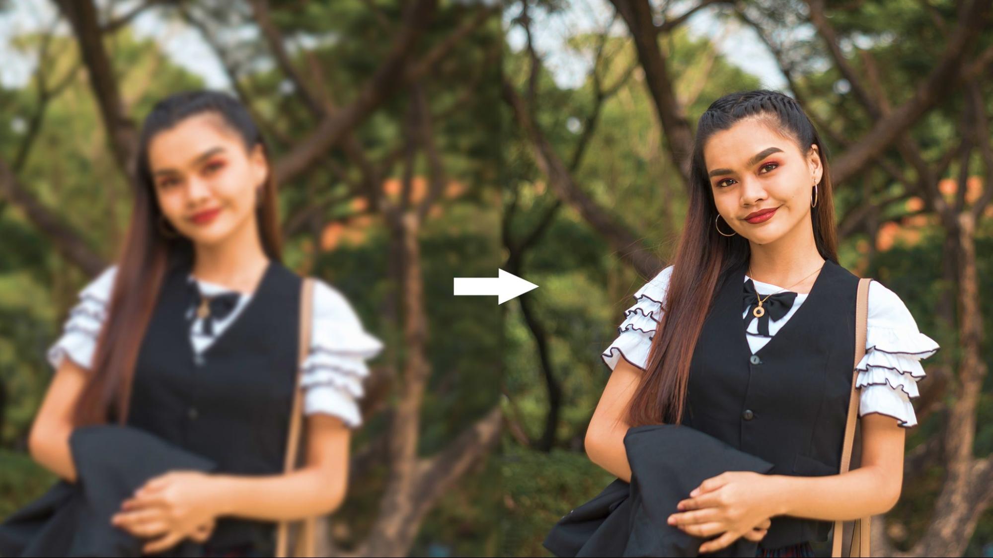
April 3, 2017 | 7186 Views | By Whitney Stevens

ON1 Photo Contest

We wanted to play along with ON1 Plus water-themed photo contest last month, so we hosted our private competition at the office! ON1 employees submitted their best water photos, and we put them up on the walls to be admired and evaluated. We had an amazing collection of pictures, here are the top 10 entries.  Please tell us your favorite photo, and we would love to get your input! The clear winner and a runner up is still being debated by our team of judges.  Having little contests is a great way to let us play with on our personal photos and use ON1 Photo 2017 of course! Tell us what you think!

Entry One:

Entry Two:

Entry Three:

Entry Four:

Entry Five:
Entry Six:

Entry Seven:

Entry Eight:

Entry Nine:
Entry Ten:

 
As the host of the contest I am exempt from entering but I thought I would still share a water pic that I took at the Beach this past weekend. As a portrait photographer, its not often that I take photos without a person in it so my share is of my son, Lennox. I really enjoy the beach experience that this photo captures.


69 comments on “ON1 Photo Contest”

  1. On April 3, 2017 at 12:13 pm Roger Maillette wrote:

    Roger Maillette

    My preference goes to number 9.
    Entry #Four would be disqualified in a photo-club contest. Nice picture but not enough water (the theme of the contest).
    Yours is a nice family picture but your son is too centered in the frame. 😉

    1. On April 3, 2017 at 12:37 pm Whitney Stevens replied:

      Whitney Stevens

      Thanks for your feedback. I don’t get to play 🙂 Was just sharing my cute son! And PS…Entry #9 is also my favorite!

      1. On April 10, 2017 at 8:02 pm Lesley Mercill replied:

        Lesley Mercill

        #9 is my favorite. I love the shot of your son. Just precious with a sense of nostalgia.

  2. On April 3, 2017 at 1:45 pm Gilbert Sauve wrote:

    Gilbert Sauve

    for me number 2 in the top because it reminds me of a delicate Chinese painting and also of a Chinese penjing.
    I suspect the author to have spent tremendous lot of time in burning/dodging and color enhancing many sections of his photo. Every where I look into the picture I find something interesting to explore … some many details.
    Great job!

  3. On April 3, 2017 at 2:31 pm Adam Rubinstein wrote:

    Adam Rubinstein

    It must be nice to live in a part of the country where such beautiful scenes and shorelines exist (more importantly, having the time to enjoy and experience them).

  4. On April 3, 2017 at 3:29 pm john wolfson wrote:

    john wolfson

    Entry 2 (color, shutter speed, framing), then entry 9 (wet feet/tripod?) – I love the family shot.

  5. On April 3, 2017 at 3:35 pm Ray Cummings wrote:

    Ray Cummings

    I would say #2. The theme is unambiguous of course it’s water. The Island of greens around it serves 2 purposes [1] It leads the viewers eyes right into it [2]It forms as it was a frame for the subject itself. Great job.

  6. On April 3, 2017 at 6:04 pm Wayne Cotterly wrote:

    Wayne Cotterly

    My choice would be #2 based on composition, with use of long exposure and reflection in the water.

  7. On April 3, 2017 at 6:43 pm Jill wrote:

    Jill

    I like #9, but admit I also like #4. I have a fascination for lighthouses.

  8. On April 3, 2017 at 11:48 pm Jean-Claude Guillen wrote:

    Jean-Claude Guillen

    My favorite is #2, nice use of long exposure and reflection in the water, then #9 as second choice.

  9. On April 4, 2017 at 2:59 am Karl Jakob wrote:

    Karl Jakob

    In contrast to earlier, are on my photos, very rare people to find – except competition I choose “Lennox”.
    But, my favorite is picture #nine – I love the little things, or is it perhaps taken from great height – very interesting!

  10. On April 4, 2017 at 5:42 am thistleamy5@gmail.com wrote:

    thistleamy5@gmail.com

    I am going to go against the tide here (pun intended) and pick #10 – it has an impressionistic feel and I love that it isn’t following any rules. I am looking for personality when I look at photography and I sense whoever shot #10 is independent and loves watching waves as much as I do. Bravo to all.

  11. On April 4, 2017 at 6:44 am Steve Abley wrote:

    Steve Abley

    Love number 10 although not keen on the border.

    1. On April 6, 2017 at 10:07 am Susan Pierce replied:

      Susan Pierce

      Number 9 has a border, 10 does not.

  12. On April 4, 2017 at 7:36 am Candice Morgan wrote:

    Candice Morgan

    It’s always great to observe how others perceive the world about them and I have to say #2 is a very sound example of composition, execution and processing/styling. Perhaps a camera club judge might say something like (the ones I have experienced anyway): ‘Pleasing, would look great as a wall display/calendar/jigsaw…’ and then veer more to #10 for its intimate composition and abstract qualities.
    Personally, I do like #2 (as others have mentioned) because my attention and eyes have plenty of nooks and crannies, colours, etc. to explore. However, it is interesting to consider that it is the water that sustains and contributes to the beautiful setting but, without the setting with its lovely colours, it would appear rather ordinary compositionally as it appears ‘too safe’.
    I do enjoy observations made from different viewpoints… high looking down or low perspective. Entry 7 gives the impression of the forceful power of that waterfall which is very different to the calm serenity of #2.

  13. On April 4, 2017 at 8:08 am Whitney Stevens wrote:

    Whitney Stevens

    Such wonderful comments and feedback. I know our staff will be pleased to see all the positive comments on their photos. Entering a photo contest can be intimidating and I was so proud of all the entries. I love being the office cheerleader and encouraging others to take photos and share them! Keep the comments coming! Thank you to everyone so far!

  14. On April 4, 2017 at 9:02 am Evelyn wrote:

    Evelyn

    I like them all, but I like #2 the best because of the contrast between the movement of the falling water and the stillness of the pool below.

  15. On April 4, 2017 at 9:42 am Dorice wrote:

    Dorice

    My choice is #9 though if eligible first pick would be little Lennox on the beach reminding us of the esprit of of childhood.

    1. On April 4, 2017 at 9:49 am Whitney Stevens replied:

      Whitney Stevens

      Thanks Dorice! That is so sweet and so true.

  16. On April 4, 2017 at 10:33 am Patricia Luijpen wrote:

    Patricia Luijpen

    I like number 2 the most if I pay attention to everything I have been learning on this great site!. Number 1 is very pretty, but too green and too much blue in the water for my taste. And honorable mentions to 3, 4 and 8.

  17. On April 4, 2017 at 10:38 am Mike Heberger wrote:

    Mike Heberger

    #2 indeed is my favorite – excellent composition & color processing. I would also agree with Evelyn’s comment about the movement of the falling water against the stillness of the pond – well done.

  18. On April 4, 2017 at 11:58 am Jim Vining wrote:

    Jim Vining

    #2 is my fav but #1 would have got my vote if the water was less blue.

  19. On April 4, 2017 at 12:39 pm Jan Todd wrote:

    Jan Todd

    My favorite is #2 – – probably because I’d like to be there! So pretty.
    I like #9, but wish it had been a little wider all around . . . not cutting off the rocks.
    And Lennox is precious!

  20. On April 4, 2017 at 2:08 pm Peter Pfeiffer wrote:

    Peter Pfeiffer

    These are all really nice – You deserve an honorable mention!
    My favorite is #9

  21. On April 4, 2017 at 2:43 pm TwoRails wrote:

    TwoRails

    I like them all, but after looking at them a couple times over a couple hours, I was consistently drawn to #3 first and #10 second.

  22. On April 4, 2017 at 6:07 pm David Claiborne wrote:

    David Claiborne

    I’d probably go 1. #2 – 2. #1, with 3rd being #9.
    Lennox is so cool that they named a furnace and air conditioner company after him.

    1. On April 5, 2017 at 1:25 pm Whitney Stevens replied:

      Whitney Stevens

      Dying laughing 🙂 My son will probably hate me for that when he is older. ha ha.

  23. On April 4, 2017 at 7:02 pm firkin@skymesh.com.au wrote:

    firkin@skymesh.com.au

    I’m always attracted by a little abstraction in “landscape” images. #2 is “so perfect” – it reminds be of a swiss publication I used to get as a kid. Every scene was “perfect”. #8 is very dramatic. #9 is very nice but its abstraction does not leave me guessing at all and the composition seems a little too symmetrical (for me). So #10 for me, though, I would have played with turning it into a b/w image
    Cheers and here’s luck
    Alastair

  24. On April 4, 2017 at 7:27 pm Liza Boyer wrote:

    Liza Boyer

    #10, then Lennox
    I think #2, though nice composition wise, the colors are over saturated.

  25. On April 4, 2017 at 7:31 pm Liza Boyer wrote:

    Liza Boyer

    My favorites are #10 and Lennox
    Though it’s a nice composition, I find the green to be over saturated in entry #2.

  26. On April 4, 2017 at 8:55 pm Arthur Troy wrote:

    Arthur Troy

    Wow they are all good but my favorite would have to be #9. It shows that you don’t have to travel to exotic places to get a great image. What you have to do is find the best angle of where you are. I will have to keep this picture in mind this summer at the beach.

  27. On April 4, 2017 at 10:36 pm electra day-smith wrote:

    electra day-smith

    love number 2 Makes me want to be there

  28. On April 4, 2017 at 11:23 pm radzi62@gmail.com wrote:

    radzi62@gmail.com

    I go with #1. The green atmosphere gives me a feeling of calmness, fresh air and engulfs with the stillness of being in a forrest. Loves the log at the top. Perhaps bring the water just a bitttt on the white side.

  29. On April 5, 2017 at 7:13 am Jennifer Stepanski wrote:

    Jennifer Stepanski

    I like #1- I agree that it’s a bit too green, but I still like it. I like the textures of the moss on the stones and the leaves on the trees contrasting against the smooth water. I like the cairns stacked on the river stones. This is a place I want to explore – of all the photos, this is the one I want to walk into- towards that warm golden light.

  30. On April 5, 2017 at 7:56 am Hunt Conard wrote:

    Hunt Conard

    I like #9 – The composition draws my eye from the water to the rocks, and back to the water. My attention does not stray from the photo, and the balance is great. I am not bothered by the static nature.
    Entry #2 is nicely balanced, but the bright leaves on the tree at the right edge tend to pull my eye away from the waterfall and out of the photo. I’d prefer those leaves to be de-emphasized or eliminated.

  31. On April 5, 2017 at 11:30 am David Price wrote:

    David Price

    I like 9, because it is quite ‘out of the box’, i.e. a new creative viewpoint. Although I am sure that actually everything has already been done before.. photography has been around for a while now. But, I could imagine it being sold as a poster. I also liked number 1, only the water is perhaps a little too blue? Maybe pop it into the Colour Enhancer and selectively adjust the blues, and maybe add some warmth to the folliage.
    Problem with camera club type photos, is that they all look more or less the same, and the judges explode when anyone does do something that is (say it quietly) creative…
    Nothing wrong with being proud of your kids, every parent should be. A shot of a great day on the beach will be worth more to you in twenty years time. Even if the composition violates the rule of thirds. Than a carefully shot photo in which your child has been forced to pose, and looks bored/fedup. Besides, leave a little room around the subject and you can crop it later.
    Best wishes, David Price.

    1. On April 5, 2017 at 12:31 pm Whitney Stevens replied:

      Whitney Stevens

      Thanks David. You are totally right. And…”Rules” are meant to be broken 🙂

  32. On April 5, 2017 at 11:55 am roar.s@1337.no wrote:

    roar.s@1337.no

    I like no.2 very good, and I should pickup a no.2 it would be no.7. Love waterfall’s . No.7 remind me of when I am hiking in the montains in western Norway

  33. On April 5, 2017 at 11:57 am Bengt Cederman wrote:

    Bengt Cederman

    I go for #4, because I think it also tells a story, the lighthouse in bright colors on a dangerous cliff, almost no shadows, really detailed, you can also imagine the cliff in a dark stormy night. When watching the photo your eyes are drawn to the buildings and the foreground almost become the “background”. Of course I like all the other nine, but the boy out of competition is really outstanding.

    1. On April 5, 2017 at 1:27 pm Whitney Stevens replied:

      Whitney Stevens

      You are so sweet! Thanks for your kind comments.

  34. On April 5, 2017 at 1:20 pm Whitney Stevens wrote:

    Whitney Stevens

    So many votes and awesome comments! Thank you to everyone….Keep the votes coming until Friday morning. Im keeping a tally and will make sure the winner from this post gets a prize. Ill also leave a comment in case any of you are curious and want to see who the winner is from both our in house judges and by popular vote!

  35. On April 5, 2017 at 1:41 pm Michael Anderson wrote:

    Michael Anderson

    Two is my favorite with One being close behind. At least one shot did not have water as the subject. 😉

  36. On April 5, 2017 at 2:43 pm Amy Perlmutter wrote:

    Amy Perlmutter

    My fav is #9. I like others also, but as Hudson likes saying, they’re a little over-processed or saturated for me. Great photos all around though!

  37. On April 5, 2017 at 5:59 pm rdbimages53@gmail.com wrote:

    rdbimages53@gmail.com

    I am having a hard time between #1 and #2. But, that said, there are some talented photographers at ON1. Nice to see.
    Off topic, how many employees are there at ON1?
    Bob

    1. On April 5, 2017 at 7:32 pm Whitney Stevens replied:

      Whitney Stevens

      Thanks Bob! That is very sweet of you. We are currently at about 25 employees.

  38. On April 5, 2017 at 7:02 pm Bob Miller wrote:

    Bob Miller

    I think I like #9. I love the detail in the rock wall. All of them are very nice though!!
    Bob

  39. On April 6, 2017 at 1:50 am Patosan wrote:

    Patosan

    I like #2, but I find the processing somehow too much. There is too much everywhere in this photo and I feel it looses its power, its focus. And yes, these leaves on the right do disturb me also!
    So, my favorite is #9. It’s quiet, it’s nice.

  40. On April 6, 2017 at 5:47 am Klaus Ratzer wrote:

    Klaus Ratzer

    #9 is my favourite because of the special viewing angle (although I don’t like the frame and for my taste the contrast is a little bit too harsh), followed immediately by #2 and #7 because I like waterfalls so much.

  41. On April 6, 2017 at 8:58 am Joanne Diochon wrote:

    Joanne Diochon

    Going to buck the trends here, I personally find both #1 and #2 over-saturated for my liking. #2 has lovely composition, but I can’t get past what I find the garishness of the colours.
    I like #9 and I also like #7, which I don’t think anyone else has mentioned yet. I like the textural interest of the rocks, and the cool tones convey the feeling of a cold mountain spring.

  42. On April 6, 2017 at 10:14 am Susan Pierce wrote:

    Susan Pierce

    I find 1, 2 & 3 to be over saturated for my taste. I like 9 and 10. As the theme is water, I would choose 10 over 9. I do wish those rocks hadn’t been cut in two on 9, but I imagine had it been shot a little wider the same thing would have happened with different rocks.

  43. On April 6, 2017 at 2:21 pm 3946galligan@q.com wrote:

    3946galligan@q.com

    I like #2 the best. #1 has a little too much vignette, but is spectacular otherwise so I give that second place and third place would be #9 for me. All are amazing!

  44. On April 6, 2017 at 5:41 pm Yves Leblanc wrote:

    Yves Leblanc

    My vote goes to number 7, the fall.

  45. On April 6, 2017 at 9:17 pm Jack Larson wrote:

    Jack Larson

    My experience is that my immediate reaction is rarely where I end up a week or a month later. I think that the more important question is why do we especially like the ones that we do. What I look for in comments is insights that might improve my eye. What I like about #7 is that although I have seen many photos of this waterfall, I never cease to be awed by the magnificent granite. In #9, which many like best, what draws me in is the feelings of peace and serenity.

  46. On April 7, 2017 at 1:13 am Christian Zuern wrote:

    Christian Zuern

    (-: (-: (-: Thank you for #5. It gives hope that On1 is not only about the Great-American-Landscape-with-longexposure-Waterfall.
    So at least one tenth of your staff knows that photography is a GLOBAL phenomena and you have customers all around the world, plus there is fineart photography and something like a history of photography outside the USA.
    Greetings from over the big pond. (-: (-: (-:
    PS: Love your shot of Lennox at the beach (could do without the texture shtik).
    PPS: The On1 software works great with ALL kind of photography! Thanks to the crew!!!

  47. On April 7, 2017 at 2:22 am Ken Murphy wrote:

    Ken Murphy

    Number 9, This is the one that holds my attention for the longest time. I always feel a landscape should give you the feeling of being there. Imagine the sensation.

  48. On April 7, 2017 at 1:01 pm Diane Imfeld wrote:

    Diane Imfeld

    Number 2 is my #1 choice. My eye immediately goes to the water, then I am motivated to explore the scene. Then, number 9 is my #2 choice. Nice to see everyone’s creative efforts!

  49. On April 7, 2017 at 4:00 pm Zoltan Puskas wrote:

    Zoltan Puskas

    All are very well done. My vote is for #9 (reminds me of the Beatles).

  50. On April 8, 2017 at 12:56 pm Sally Harms wrote:

    Sally Harms

    They are all nice. #2 is over saturated for my tastes, as is #7, but I like them both. The border on #9 really solidifies the image and I really like the composition and idea, but I think I would vote for #10 because I love the texture and creativity it suggests.

  51. On April 12, 2017 at 10:27 am suekelso09 wrote:

    suekelso09

    I like #7 because the water is the main focus of the photo. Several others have water as an element in the photo and some do not have a foreground item of interest. I would be happy to say I was the photographer of each of these photos though.

  52. On April 12, 2017 at 11:00 pm Pat Sanders wrote:

    Pat Sanders

    I like #7 the best – love the sense of height and majesty.

  53. On April 16, 2017 at 10:46 am Fran Balderrama wrote:

    Fran Balderrama

    My fave is #9.I am a -101 photographer so technically i cant tell you why….just like it! I also like the little boy on the beach. Would love to be able to photograph my grand kids in compositions like that.

  54. On April 21, 2017 at 8:58 am Bridget Haddad wrote:

    Bridget Haddad

    My vote goes to #9 because I’m really drawn to the textures, the patterns in the sand made by the water and the colors of gold sand, black rocks and clear water.
    The pic of the little boy running on the beach is super cute. I love the expression on his face and the fact that he’s running around and just looks so happy 🙂 The only thing I would change is the composition. I would have maybe gotten down lower and gotten closer so it’s more about him cuz the background is bare (and the center comp doesn’t look right). That totally would mean getting wet though 😉

  55. On May 4, 2017 at 2:50 pm Whitney Stevens wrote:

    Whitney Stevens

    Thank you to everyone who has voted and commented! I appreciate all the wonderful feedback and votes. After tallying through the votes I decided to give two prizes out for the most popular. Entry #2 and Entry #9 are the winners! #9 also won with the judges in house! It was a very fun and successful contest. A new one has been posted (theme: Spring/Floral) if you have a minute check it out and make your vote!

Leave a Comment